Your menu is one of the most important sales tools in your restaurant.
Think about it: almost every customer who walks through your door looks at your menu before deciding what to buy. Yet many restaurant menus are treated as little more than a price list—a place to put the names of the food, a short description, and what everything costs.
A properly designed menu should do much more.
It should make your food look appealing, make the menu easy to navigate, draw attention to the items you want customers to notice, and ultimately help increase the profitability of your restaurant.
Over the years, I’ve examined and redesigned a lot of restaurant menus. And just like a doctor begins by looking for symptoms, there are certain warning signs I look for almost immediately when examining a restaurant’s menu.
Here are five common symptoms of an unhealthy restaurant menu—and my prescription for each one.
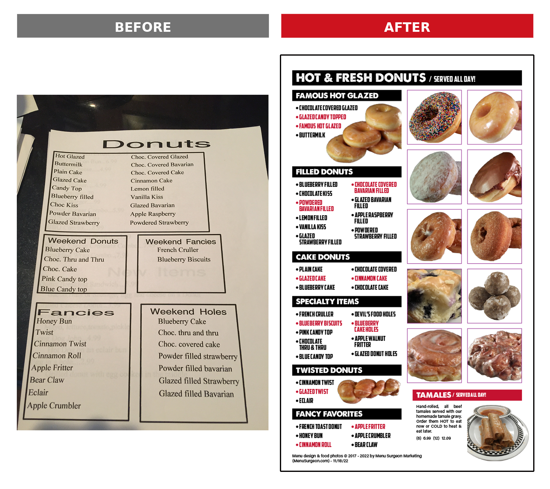
Symptom #1: There Are No Food Photos
There’s a reason restaurant advertising is filled with photographs of food. People eat with their eyes.
A great food photograph can communicate something in seconds that several lines of copy can’t. It can make a customer hungry and get them thinking about a particular dish before they’ve even finished looking through the menu.
A menu without food photography can feel drab and lifeless, but the bigger problem is the missed sales opportunity.
The solution isn’t to fill every available inch of the menu with pictures, either. Too many photographs can create an entirely different problem.
Food photography should be strategic.
Menu Surgeon’s Prescription
Identify some of the restaurant’s most profitable items and professionally photograph them. Then strategically feature those photographs on the menu.
The objective isn’t simply to make the menu prettier. You’re using photography to bring attention to particular dishes you’d like to sell more of.
And once you have professional photographs of those dishes, their value extends far beyond the printed menu. Those same images can become valuable marketing assets for your website, social media, online ordering, advertising, and other promotions.
One professional food photography session can provide a restaurant with content it can use over and over again.
A great-looking photograph can help transform a menu from a simple list of food into a much more effective sales tool.
Symptom #2: Your Prices Are Placed in a List
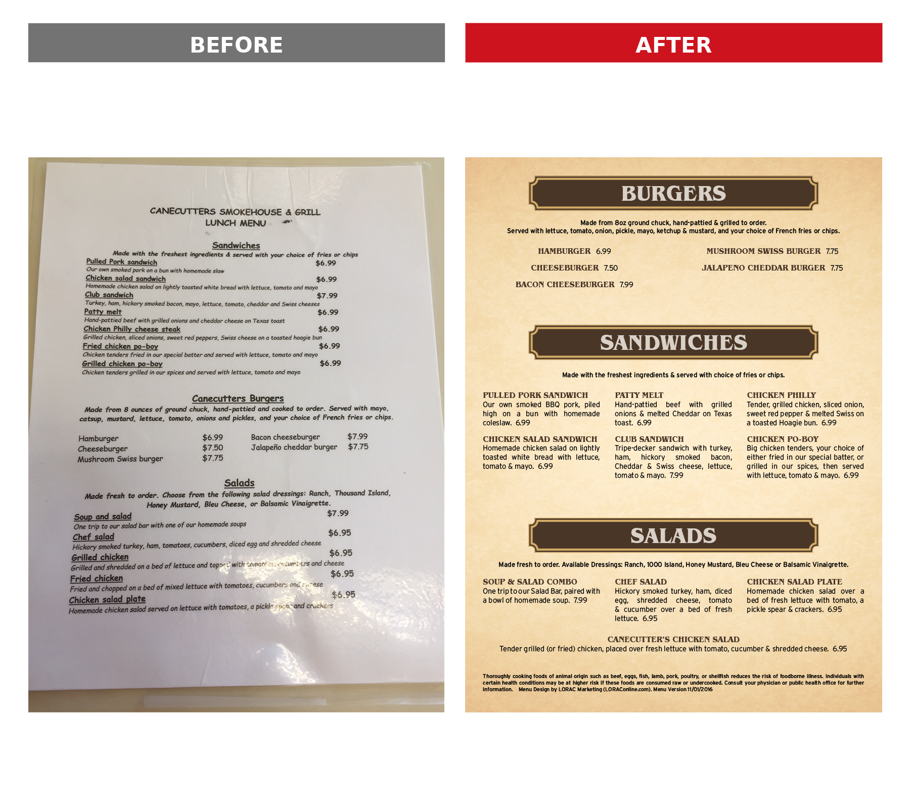
This is one of the easiest symptoms to spot. Look at your menu prices.
Are they all neatly lined up in a column down the right side of the page? If they are, you’ve made it extremely easy for your customers to shop your menu by price. Their eyes can move straight down that column:
14.99
16.99
18.99
21.99
24.99
Instead of asking themselves, “What sounds good?” you’ve made it easier for them to ask, “What’s cheap?” That’s probably not the buying behavior you want to encourage.
Price columns also consume valuable menu real estate. The space devoted to maintaining that neat column could instead be used to improve the layout, make descriptions easier to read, or create room for strategically placed food photography.
Menu Surgeon’s Prescription
Don’t put all of your prices in a straight vertical list. Instead, place each price at the end of the item’s description and allow the prices to naturally stagger throughout the menu.
You can also deemphasize the prices typographically rather than making them one of the most prominent elements on the page. I’d also suggest you don’t use the dollar sign ($) on your menu. If you’re in America, all prices are in dollars, so the ($) is unnecessary and calls too much attention to the price. The customer can still easily find the price when they want it. We’re not trying to hide anything. We’re simply changing what gets their attention first.
Ideally, you want the customer thinking: “That sounds delicious.” Then they see the price. Not the other way around.
It’s a relatively simple design change, but it can help elevate a menu from a basic list of items and prices into a more effective sales tool.
Symptom #3: Your Prices End in Five or Zero
Take another look at your menu prices. How many end in 5 or 0?
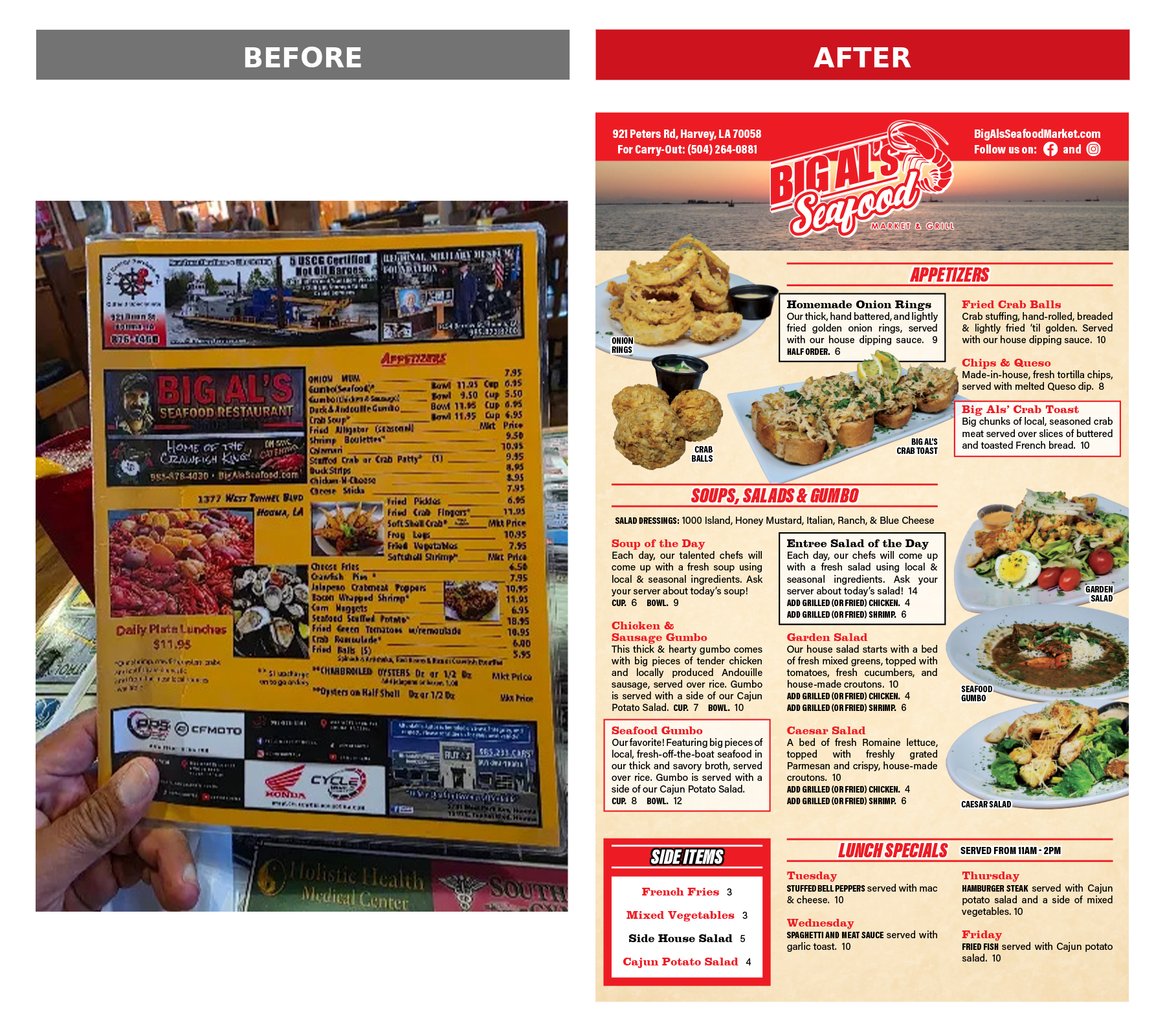
Maybe you have prices like: 12.95 | 14.50 | 17.95 | 20.00
This may seem like a minor detail, but when you’re selling hundreds or thousands of menu items, small amounts of money can add up.
Menu Surgeon’s Prescription
One option I’ve used is adding four cents to prices ending in five and removing one cent from prices ending in zero.
For example: $12.95 becomes $12.99. $14.50 becomes $14.49.
Those few pennies probably aren’t going to determine whether a customer orders the item, but multiplied across a large number of sales, they can mean additional revenue for the restaurant.
Another option—particularly as menu pricing has evolved—is to eliminate cents altogether and use whole-dollar pricing.
$8.99 becomes $9.
Whole-dollar pricing can create a clean, contemporary menu and eliminates unnecessary visual clutter.
There’s another advantage to getting away from a menu filled with prices ending in 0 and 5: future price adjustments can be less conspicuous.
Restaurants operate in a volatile environment. Ingredient costs change. Labor costs change. Insurance, utilities, supplies, and practically every other operating expense can change. Your menu needs to give you enough flexibility to respond.
A restaurant shouldn’t leave money on the table simply because a particular number “looks right.”
Symptom #4: Menu Items Aren’t Placed for Maximum Impact
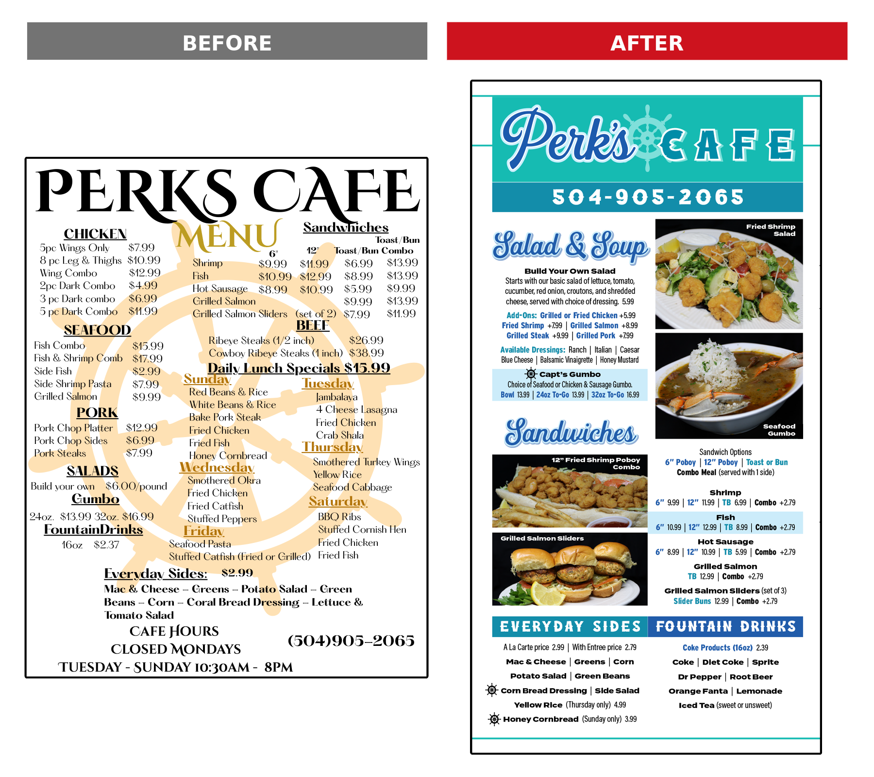
When you look at your menu, where does your eye go first? That’s not a trivial question.
Customers don’t necessarily read a restaurant menu the way they read a book. Their eyes move around the page, scanning sections, headings, photographs, highlighted areas, and individual items. If your menu is simply one long, undifferentiated list, you’re giving up much of your ability to influence that journey.
A poorly organized menu commonly has several problems: Items aren’t clearly organized. Nothing stands out. And the customer isn’t given much visual guidance about where to look first.
Menu Surgeon’s Prescription
Start by grouping items into logical categories so customers can quickly find what interests them. Then determine which items deserve additional attention. That might involve strategic placement, a photograph, a box or other graphic treatment, a change in typography, or the careful use of color.
But highlighting shouldn’t be random.
If you know which dishes generate strong profits for the restaurant, those are obvious candidates to consider featuring more prominently. The objective is to create a visual flow through the page. You want to make the menu easy to navigate while intentionally interrupting that natural eye movement in certain places to call attention to selected dishes.
That’s one reason good menu design isn’t simply graphic design.
The location of categories, the order of items, the placement of photographs, and the areas you choose to emphasize can all influence what customers notice. If everything looks exactly the same, you’ve left those decisions entirely up to chance. And if you highlight everything, you’ve essentially highlighted nothing.
A healthier menu creates a visual hierarchy: it helps customers move through their choices while giving certain profitable or strategically important items an opportunity to stand out.

Symptom #5: Your Menu Suffers From Information Overload
More isn’t always better. One of the most common problems I encounter is simply too much information crammed into too little space.
Too many menu items. Too many categories. Too much text. Not enough organization. The result is a menu that’s difficult to read quickly.
Restaurant owners sometimes resist adding pages because they believe a smaller menu is automatically better. But squeezing everything onto fewer pages isn’t necessarily helping the customer.
White space isn’t wasted space.
Giving menu sections room to breathe can make the entire menu easier to understand.
Menu Surgeon’s Prescription
Start by grouping similar items together. Break up large blocks of information so customers can scan the menu more easily. Give major sections enough room rather than squeezing them together simply to reduce the page count. And then ask a harder question:
Do all of these items really need to be on the menu?
This is where menu design and menu profitability begin to intersect. If an item isn’t selling and isn’t generating sufficient profit, you should at least examine whether it deserves valuable space on the menu. Removing an underperforming item can do more than improve the numbers. It can simplify inventory, reduce clutter, and create more room to properly showcase the dishes you actually want to sell.
The goal isn’t necessarily to create the smallest menu possible. The goal is to create a menu customers can understand and navigate quickly.
These Aren’t Just Design Tricks
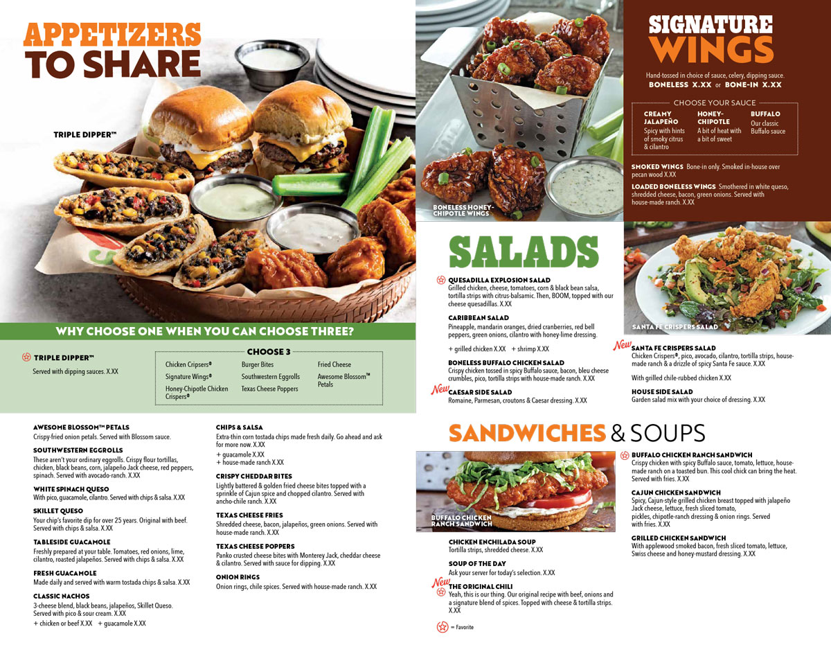
None of these ideas require a restaurant owner to take my word for it. Look at the menus produced by successful franchise and chain restaurants. (This one is from Chili’s ▶)
They invest enormous amounts of money studying customer behavior and figuring out how to sell food. Look closely and you’ll see many of these same principles in action:
- You’ll see professional food photography.
- You’ll see menus that don’t emphasize prices in neat columns.
- You’ll see carefully organized categories.
- You’ll see certain products given more visual attention than others.
- And you’ll see layouts deliberately designed to direct the customer’s eye.
Independent restaurants may not have the research and marketing budgets of the big chains, but there’s no reason they can’t learn from what those companies have already discovered.
Is Your Menu Showing Any of These Symptoms?
If you’ve recognized your restaurant menu in a few of these examples, don’t panic. It doesn’t necessarily mean you need an entirely new menu. Sometimes a few strategic changes can make a substantial difference. But before changing the design, we prefer to understand what’s happening underneath it.
Which items are selling? Which ones are profitable? Which items should we be encouraging customers to order? Which ones are taking up valuable space without earning their keep?
That’s where Menu Engineering comes into the picture.
At Menu Surgeon, we approach restaurant menus from both sides: profitability and design. The numbers can help determine what we want customers to notice, and the design can help us direct their attention there. That’s why we like to say…
We Diagnose Before We Design.
Your restaurant doesn’t just need a menu that looks better.
It needs a menu that performs better.
If you’d like another set of eyes on your restaurant’s menu, Schedule a Consultation with Menu Surgeon. We’ll take a look at the symptoms and determine what—if anything—the patient needs.